
Time for the second ring of my Three-Ring Confidence framework: Design. Today is all about taking that big top brand energy we uncovered last week and turning it into a visual identity that screams me.
Spoiler: designing my own brand wasn’t the smooth ride you’d expect from someone who does this for a living. It was a chaotic, stomach-butterfly-inducing tightrope walk, full of self-doubt and big decisions. From wrestling with colours to taming the shiny-object urge, I’m spilling the tea on how I brought this circus to life without losing sight of who I am. If you’ve ever wondered how to create a visual identity that feels like you, grows with your business, and doesn’t alienate your audience, this is one you’ll want to tune into.
And if you want help with rebranding yourself… I’m booking Extravaganza projects for the rest of 2025: only 5 spots left! Apply now & let’s design a brand that looks the part, acts the part & sells out.
Quick refresher on the framework I use for myself and all my Extravaganza clients:
Here's what you might think: Eva's a brand designer. Designing her own rebrand must've been easy, right?
Wrong. So, so wrong.
Trying to visually explain what my business — that I've been running for going on six years — is actually about is the worst thing ever. While I can do this pretty easily (and have a lot of fun doing it) for other people, doing it for myself is a whole different story.
The pressure is even greater when everyone expects you to do a really good job because you're a designer yourself. Your own brand is the biggest piece of your portfolio. And that pressure gets even greater when you remember what a rebrand actually is — not just visuals, but a deeper transformation.
With every minute design decision, every pixel you move, you start thinking: Does this actually reflect my personality? Does this say what I wanted to say? Will my audience find this a bit too weird and walk away? Will they understand what I'm trying to do here? Is this the greatest or the worst decision ever — one, rebranding, and two, doing it for myself?
And lastly, the grand finale: Am I even good enough at design?
All of these cross your mind. The stomach butterflies grow bigger and bigger as the launch date appears.
Here's what I learned: you need a deadline when doing these things for yourself. Otherwise you just won't.
But those stomach butterflies and discomfort are a sign of growth. When you're rebranding, you're pushing the boundaries of what you previously knew — you're evolving beyond what was familiar.
When I say that your brand is the eternal work in progress, this is exactly what I mean. When you're building a memorable brand that's meant to stay in the game for the long run, you can't afford to stay stagnant. You have to grow and adapt and reinvent yourself in order to stay relevant.
That doesn't mean in this process of rebranding that you have to lose sight of who you are.
This was a big turning point in the design decision-making when I rebranded myself. Even though I was changing from Eva Couto Design to Flying Colours Creative® — going from just my name to suddenly having this whole circus theme — I didn't want it all to be erased. I didn't want to start a journey from scratch. I wanted to grow on what I had previously built.
It's a tightrope to walk between the urge to constantly reinvent ourselves and the safety of what feels familiar, of what you can see is currently working. And it takes a lot of courage to sit down with your brand and pull back and be objective about it. That's why I brought in Katie Pannell for the direction, because for that first step, I felt like I couldn't be that objective — I was way too close to my own brand.
But for us ambitious, driven, creative small business owners, this whole process of detaching ourselves from it a little bit feels really daunting, like you're required to change a part of yourself too. We so often equate our brand and business with our own personality and our own self as well.
So if you're considering whether or not to rebrand, my first piece of advice would just be to embrace this discomfort and push through it. It's a very necessary part of the journey, even though it's uncomfortable. And it's a sign that you're evolving and pushing beyond the familiar to create the greatest show on earth.
The concept we had was the big top brand energy, the fun house — where everyone's personality is a true original, the one thing that your brand can reflect because it's the one thing nobody else can copy.
I could have chosen to hire another designer to do this for me. They probably would have had better insight because they were not as close to my own brand. But I actually wanted to enjoy the freedom of having a brief with no limits. There wasn't a timeline per se. There wasn't a budget limit. I could do whatever the hell I wanted, be as crazy or as minimal with animations and extra stuff. I just really wanted to have fun and use my own brand as a portfolio piece to explore my own skills.
From this big top brand energy concept, I collaborated with Katie on a Pinterest board to really define what this looks like and make sure that I was seeing what she was seeing when she spoke to me about this new concept.
Pretty soon, we realised that we had to do a bit of editing. I wanted the brand to feel very playful and colourful and have a sense of wonder, but it could not be chaotic or childish or have this nostalgic ephemera look to it. I wanted it to give this sense of wonder so that you were drawn to movement and those bright warm colours — just like you do at a real circus, where that spectacle makes you question what's possible and makes you feel creative and ambitious.
Even though we started out with imagery that reflected that old school circus and those cool posters from P.T. Barnum (there was a lot of inspiration pulled from The Greatest Showman), we edited it down further and further until we reached this look that was just the right amount of playful and that embodied this brand theme without it being so over the top that you would lose sight that the whole brand is about a design studio.
To be really specific: I already had a lot of the colours you see now. I already had this salmon-y, peach-y light background colour, the bright red, the bright blue. But then I had a bunch of other colours that were kind of just added in as accents, because at the time I didn't have enough room to play with. I just added those in and then never really used them correctly because I was adding stuff in without having any real intention behind it.
So I kept those main colours that I was already known for — the bright red, the bright blue — but added a couple of other supporting colors to the palette to really help me use my own assets while also giving enough play and diversity that I could work with as the brand grew.
I was working on my offers at the time. I knew that I was going to have a couple of different offers, change things around, and I wanted each offer to be distinctive visually from each other, but also to belong to the main Flying Colours Creative brand.
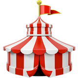
I needed room to play while everything stayed cohesive. So I added in this lighter blue and then created a bunch of different icons that were specific to the circus theme — the circus tent, the cannon, the rings of fire, the flag, tickets — to further accentuate this theme without it being really over the top or really childish, because I could control the style of the illustration so that it matched everything else.
And then really simple patterns that instantly evoke that circus theme, like stripes. I could do the stripes with different colour combos, but my main goal with all of these really specific design choices was just to future-proof my brand in a way that maybe I could spend another five years without really doing a major rebrand, but just tweaking it here and there and adapting it as the services would naturally evolve.
Next week, we're going to talk about how I implemented this design. Now that I had set the colours, the fonts, the logos, the icons and the patterns, it does nothing for me if they all stay in a folder on my computer. I actually have to use them. And there's a learning curve to using new assets, learning what looks good together, how to work with all of these different elements — especially when it comes to online presence, social media, website.
That was a beast to tame, but we'll get into all of that next week!
—
✦ THE EXTRAVAGANZA: 12-week, all-inclusive brand transformation that gives you all the visuals, website and marketing assets it takes to succeed with Flying Colours
✦ Follow Katie Pannell, from 26&thensome
✦ Read the brand naming case study behind Flying Colours Creative®


Over the last 5 years as a Brand & Marketing Designer, I’ve helped freaks like us design their unconventional brands so they can step onto the main stage & own their weird. Because if you wanted to be, look or sound like everyone else, you wouldn’t be where you are today. Now it’s your turn.
get to know me
New email every Thursday to make your personality roar.
SIGN UPYou’re not here because your brand needs fixing. You’re here because your brand is evolving, and it’s time to step into the centre ring. When you show up as exactly who you are, something magical happens: The right people lean in. They remember you. They choose you. And then? You succeed with Flying Colours.
All-access ticket to “turn-key” branding, website, and marketing assets for the visionary service provider
leading their industry who just needs their visuals to match their energy.

Every visionary’s best kept secret to their success – the direction and action plan that keeps them from clowning around. Let’s close the gap between your big top personality and juicy business vision.

Launch prep can feel like juggling flaming torches while riding a unicycle & your genius deserves better than spending hours fiddling with fonts and resizing images. Ditch the design stress and focus on what you do best.